Compositions
The Compositions page contains information about all of your compositions. Compositions are combinations of design and text elements that can serve as personalization templates for your customers.
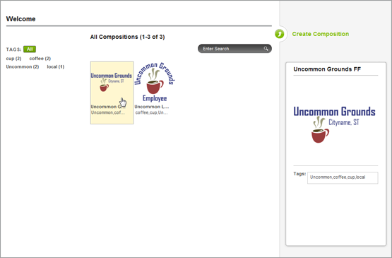
This list in the center column of the page contains the compositions. When several compositions have been created, more pages will be added. Hovering over a composition will bring up a preview in the right column of the page.
Editing, Duplicating, and Deleting Compositions
To edit an existing composition, select the composition from the center column by clicking on it. This will bring up a page with all the same tools as the create composition page. In the top right corner, you have the option to edit the composition. Click on that and you will have access to the editor and the elements.
To duplicate an existing composition, select the composition from the center column by clicking on it. This will bring up a page with all the same tools as the create composition page. In the top right corner, you have the option to duplicate the composition. Click on that and you will be taken back to the main compositions page. This time, however, there will be two identical compositions. You can now use one of them as a starting point for another composition.
To delete an existing composition, select the composition from the center column by clicking on it. This will bring up a page with all the same tools as the create composition page. In the top right corner, you have the option to delete the composition. Click on that and you will see an alert asking if you want to delete the composition. Click OK to delete it.
Creating Compositions
To create a composition, click on the Create Composition link at the top of the right column in the compositions page. This will bring you to the composition creation page.
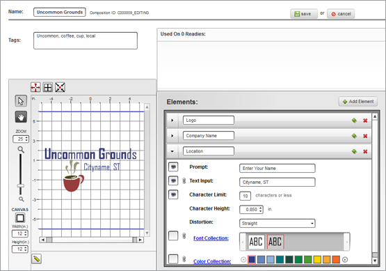
Add a name for you composition and any tags you want in the fields in the top left corner of the page. Separate multiple tags with comas.
Elements
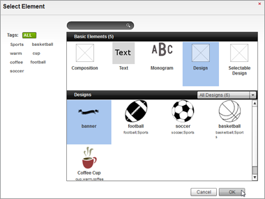
To add elements to your composition, click the Add Element button on the right side of the Elements window. From the Select Element window popup, select either a design, text element, monogram, user selectable design, or another composition. Once the type of element has been selected, click OK. Double-clicking on an element type will accomplish the same as selecting and then clicking OK. Once done, that type of element will be listed in the Elements list and can be modified from there.
Expanding Elements: Information on the elements in the list can be expanded or collapsed by clicking on the arrows to the left of the element names.
Layering Elements: The order of the elements can also be changed by clicking and dragging an element up or down in the list. This will change the layering of the elements in the composition.
Duplicating Elements: To duplicate an element, click on the small green plus on the right side of the element in the element list.
Deleting Elements: To delete an element, click on the small red �X� on the right side of the element in the element list.
Design Elements
To add a design element to a composition, select "Design" from the Basic Elements list. Then, choose the design from below. Your choices can be filtered by selecting from the design collection through the drop-down menu on the right. Click OK to finalize your selection and add the design element to the composition.
Selectable Designs
Selectable Design elements allow the end user to choose from a group of designs. These groups are determined by your design collections from the library. The additional option exists of allowing the customer to upload artwork.
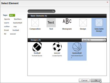
To add a selectable design element to a composition, select "Selectable Design" from the Basic Elements list. Then, choose the design collection from which the end user can select a design. The design collection is selected through the drop-down menu on the right.
Once the design collection has been selected, choose the default design to appear from the choices below. Click OK to finalize your selection and add the selectable design element to the composition.
To allow a user uploaded design, click on the toggle to ON.
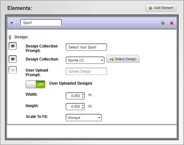
Width & Height: Specify the maximum dimensions allowed for the user uploaded design.
Scale to Fit: Select whether the design should be scaled to the specified dimensions. The options are "never", "always", and "only when bigger".
Text Elements
When a text element is added to a composition, there are several parameters to be set before the composition is complete. The first of which would be the name. This is for your information only and is not visible to your end customers.
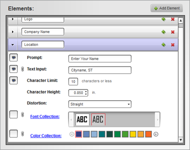
Visible Icon: To the left of many of the parameters, there is an eye icon in a box. This acts as a show/hide or active/inactive toggle. Clicking in the box will either add or remove the icon which controls if your customers will see that option in the personalization interface. If there is an eye in the box, the field can either be seen or used in the popup.
Prompt: This field can be seen by your customers in the personalization interface. If the text field you are creating is meant to be personalized, give your customers some instruction through the use of this field.
Text Input: Enter the text you want to use in the composition. If this element will be customizable by your customers, enter sample text. If this field is active, you customers can change the text. If it is inactive, the text will appear in the composition, but it will not be able to be altered by your customers.
Character Limit: This limits the number of characters that may be used if the text element is editable by customers.
Character Height: This specifies the approximate height of capital letters. This may vary slightly depending on the serifs or decorative elements of the font.
Distortion: This allows you to choose between a straight or arced baseline for your text element.
Font Collection: This allows you to choose a font collection and a default font, and if active for customers, limits your customers to the use of fonts only in that collection.
Color Collection: This allows you to choose a default color for the text element, and if active for customers, limits your customers to the use of colors only from that collection.
Linking: Using the chain link icon, you can link the text input, font collection, and/or color collection to other text elements. This means that if the customer changes the parameter for one element, it will be matched in another. This could be used for information that would be repeated like a customer�s jersey number in two locations. The customer would only need to enter the number once.
Monogram Elements
When a monogram element is added to a composition, there are several parameters to be set before the composition is complete. The first of which would be the name. This is for your information only and is not visible to your end customers.
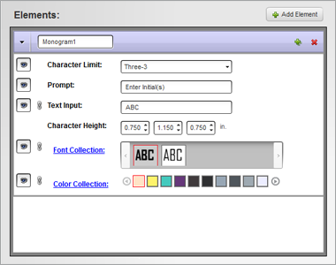
Visible Icon: To the left of many of the parameters, there is an eye icon in a box. This acts as a show/hide or active/inactive toggle. Clicking in the box will either add or remove the icon which controls if your customers will see that option in the personalization interface. If there is an eye in the box, the field can either be seen or used in the popup.
Character Limit: This limits the number of characters that may be used if the text element is editable by customers. Choose between a one, two, or three letter monogram.
Prompt: This field can be seen by your customers in the personalization interface. If the text field you are creating is meant to be personalized, give your customers some instruction through the use of this field.
Text Input: Enter the text you want to use in the composition. If this element will be customizable by your customers, enter sample text. If this field is active, you customers can change the text. If it is inactive, the text will appear in the composition, but it will not be able to be altered by your customers.
Character Height: Specify the height for each of the letters in the monogram.
Font Collection: This allows you to choose a font collection and a default font, and if active for customers, limits your customers to the use of fonts only in that collection.
Color Collection: This allows you to choose a default color for the text element, and if active for customers, limits your customers to the use of colors only from that collection.
Visual Editor
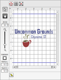 The
editor in the left column is used for scaling and positioning elements
within a composition.
Pointer Tool: This tool is used for moving, scaling, and rotating elements in the composition.
Selecting: To select an element, click on the element in the editor. The topmost element will be selected. If a different element is needed, it may be easier to select it first from the Elements list. Selected elements will display a box around it with open squares in each corner and a rotation handle extending from the top.
Positioning: To position an element, click on an element in the editor and drag it to the desired location.
Scaling: To scale a selected element, click and drag on one of the open squares in the corner of the selection box. The element will scale proportionally.
Rotating: To rotate a selected element, click and drag on the rotation handle extending from the selection box.
Hand Tool: This tool is used for moving the view of the canvas. If zoomed in to a tight view of the design, the hand tool can be used to click and drag on the image to change the view without moving any elements. The scroll bars on the bottom and side of the editor can be used to accomplish the same task.
Canvas: Specify your canvas size and shape for the composition. This is the decoration area. Make sure that this does not exceed what you are capable of producing.
Zoom: With either the slider or by use of the number, you can adjust your zoom level for the editor.
Full Screen Editing Mode: To extend your work area to include the majority of your screen, click on the icon with four red arrows pointing outward. To exit, click on the icon again.
Design Origin: Display the center of your canvas by clicking on the Design Origin icon. The origin will be display with a red cross.
Center Design: To center the design on your canvas, click the icon with four black arrows pointing to a small red dot.
Ruler: The ruler allows you to measure specific elements of a design by clicking on the tool and then clicking and dragging across your design. The length of the line will be reflected in your specified unit of measurement.
Finding Compositions
Compositions can be found on the main compositions page by typing the name or part of the name or tags in the search field and clicking the magnifying glass. Only compositions that contain that information will be displayed in the list.
The Composition list can also be narrowed by clicking on any of the tags listed in the left column. If multiple tags are selected, only compositions tagged with all of the selected tags will be displayed. Selected tags will be displayed with a green box behind them. Clicking on a selected tag will deselect it.
Tags will also display the number of compositions with that tag.